Kelly
This project started as a rule-based study of Ellsworth Kelly’s shapes, colors, and spacing.1
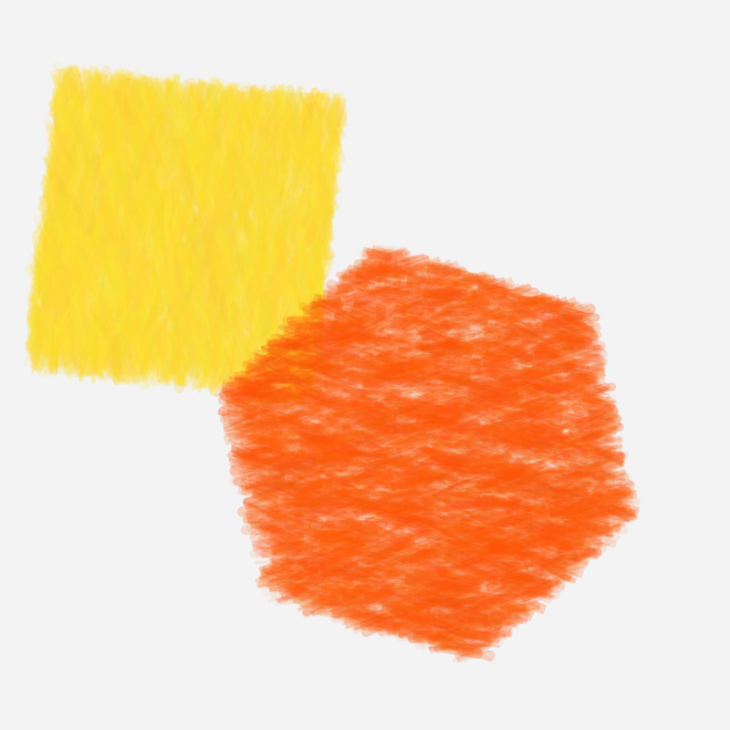
The images above are from the longer first version, where each form was built by drawing many short strokes by hand.
Later, I rewrote the renderer to use p5.brush, but the same two parts stayed central: the palette and the surface texture.
Why rules
I treated this as a rule-based project from the beginning. There are not that many reference images to learn from, and I did not want to pretend a small hand-picked set was enough for a convincing ML approach. It felt more honest to look at the work directly, pull out a few consistent ideas, and build the generator around them.
The rules came from a mix of looking and measuring. I used a small set of reference images to extract dominant palettes, then clustered those colors to get a compact set of recurring tones. I also ran simple image analysis to detect large contours and basic shape types, mostly to confirm the obvious patterns: few shapes, large coverage, and a strong bias toward rectangles and simple divisions.
Color and layout
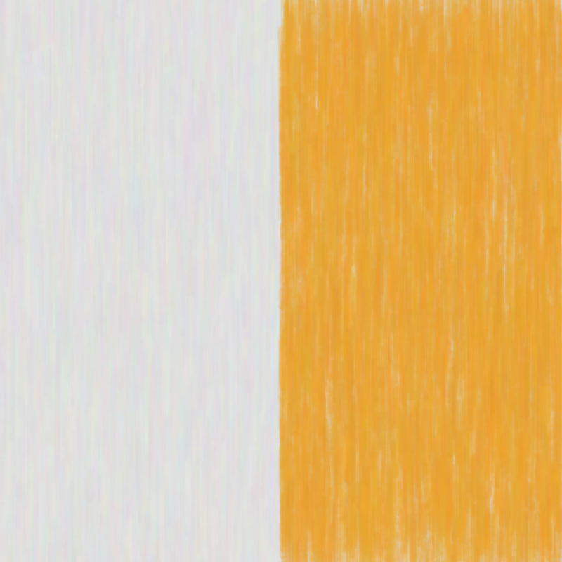
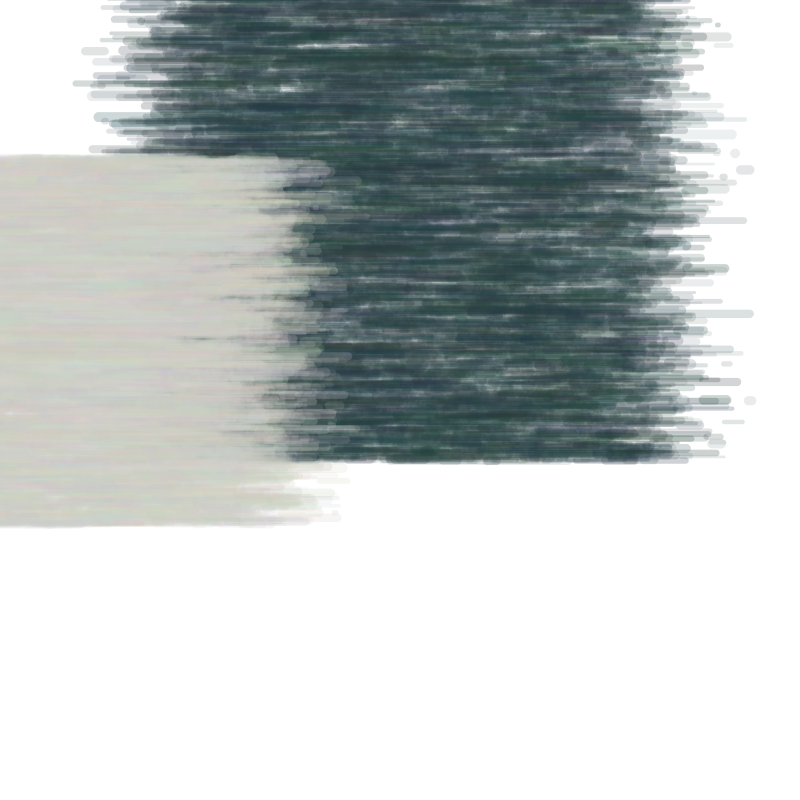
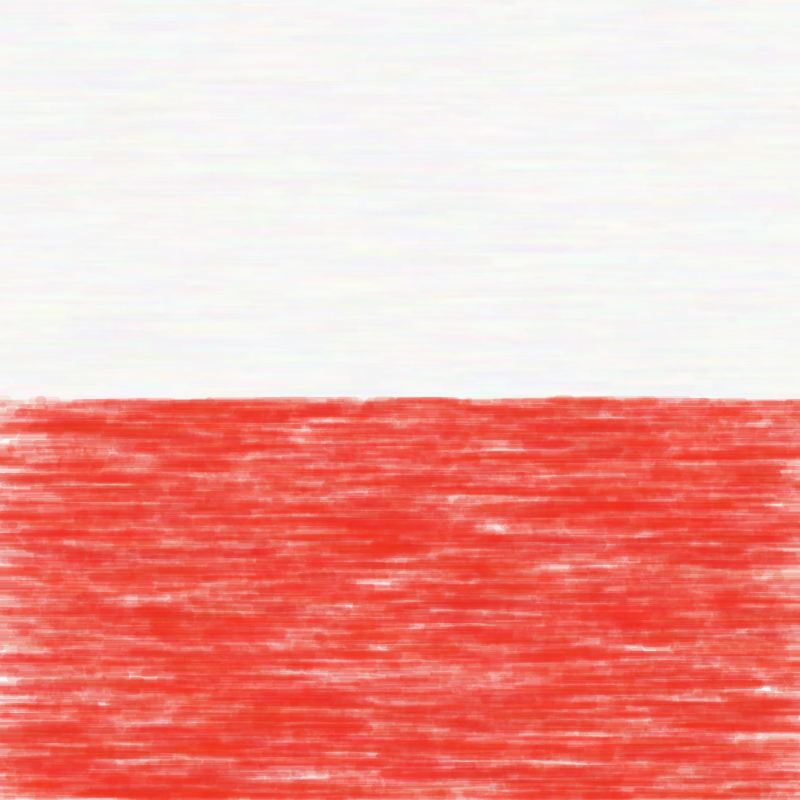
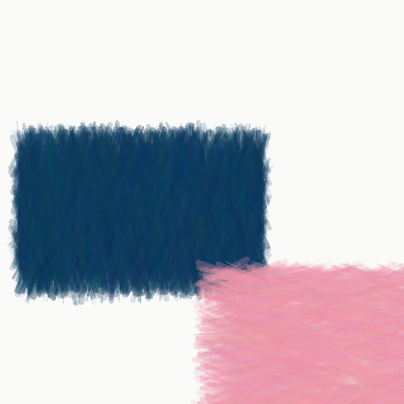
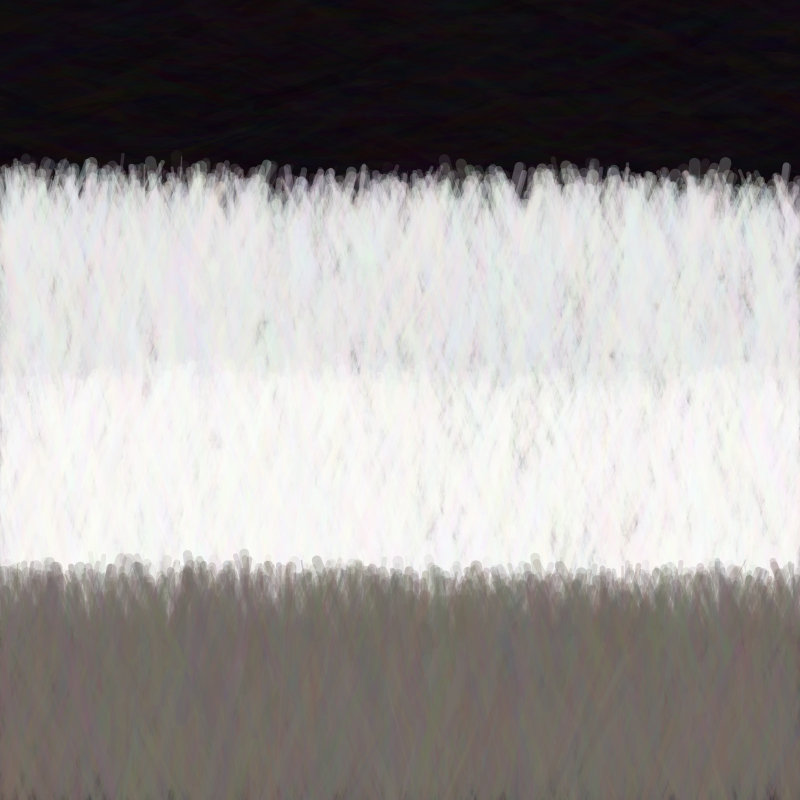
Most of the structure comes from keeping the compositions simple. I bias the generator toward large rectangles, stripes, and a small number of shapes, so the image usually reads as a few clear blocks instead of a busy arrangement. The first few images show that most directly: a vertical split, a dark block against a pale one, or a single red band across a quiet background.
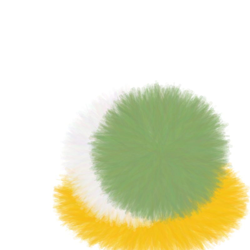
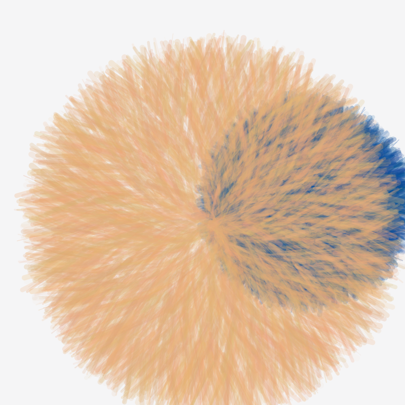
The palette is also tightly constrained. I mostly work with off-white, muted green, yellow, red, blue, and a few other colors pulled from Kelly paintings, then only use a small subset at a time. That keeps the images calm even when the shapes get softer and start to overlap more.
Surface texture
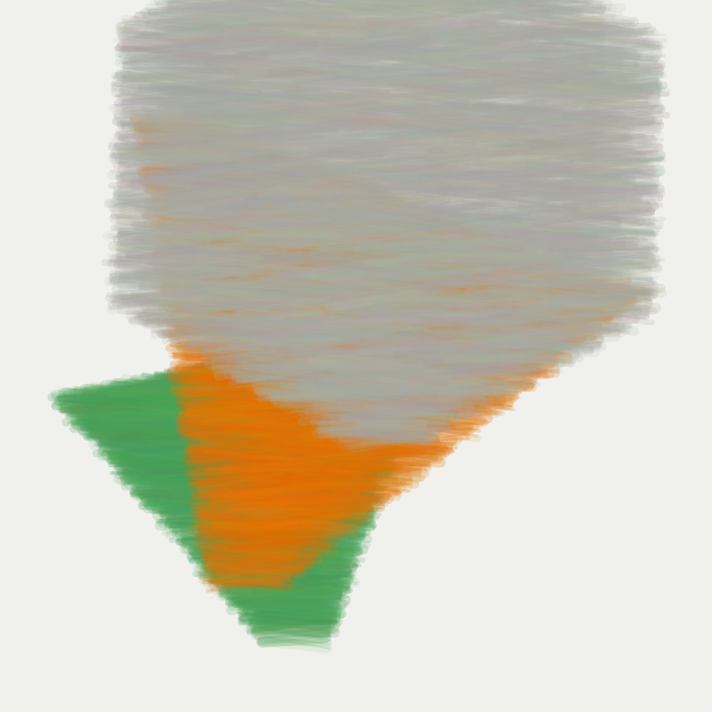
The long first pass of this project was about drawing the fill manually. Instead of using a normal digital fill, I packed each shape with thousands of short strokes and kept adjusting how they behaved: angle variation, softer boundaries, flow-field-based stroke direction, multiple layers, and thinner, denser marks. That is where most of the texture in the images above comes from.
You can see the progression in the grid. The earlier pieces still feel more geometric, while the later ones get fuzzier at the edges and start to feel more like colored paper or pastel. The last image pushes that the farthest, with the form almost dissolving into the background.
After that, I changed direction and replaced most of the custom stroke logic with p5.brush.
That version is much simpler: instead of manually placing every mark, it uses the brush library’s hatch and outline behavior to get a similar softness with less code.
The later rewrite was simpler, but I was less satisfied with the results.
The extra detail in the first pass makes me more attached to the images shown here.
-
This post was co-written with Codex. ↩