Recoloring
Introduction
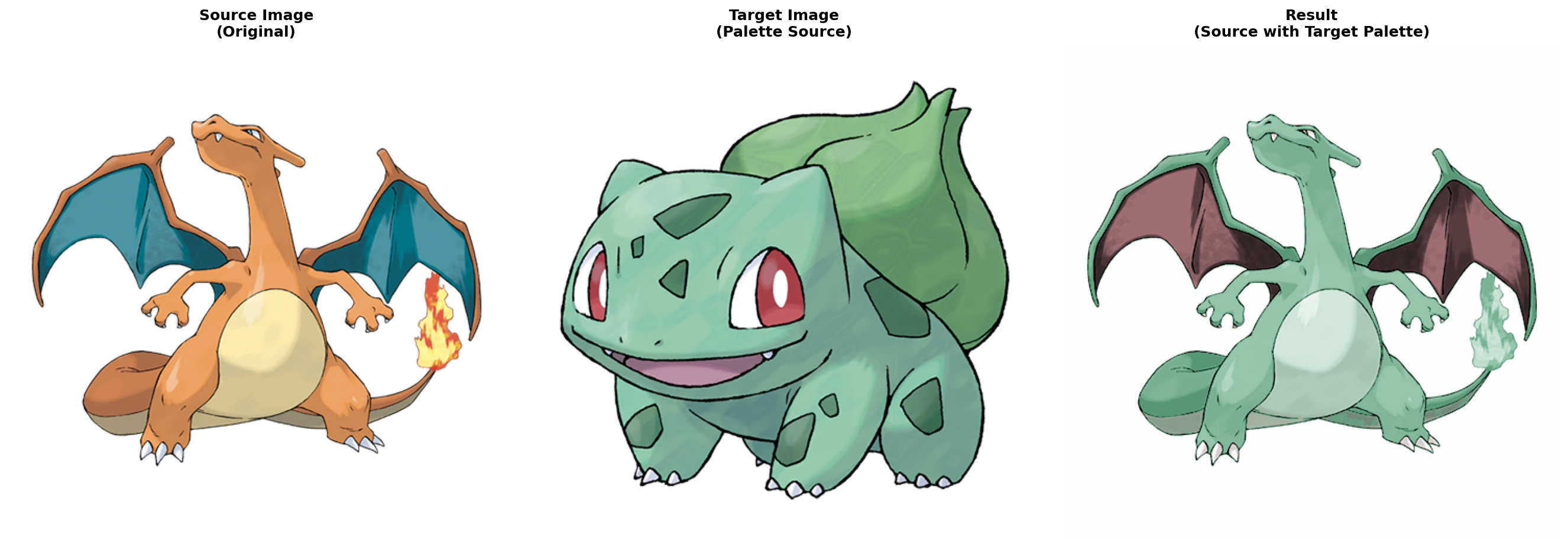
I saw this project a couple of years ago and found it super interesting. What it does is swapping the colors of two images in an aesthetic way. The effect is a color transfer from one image (i.e. source) to another (i.e. target). Using Pokemons as an example, you can see my reproduced results below: the orange Charizard is recolored using the major colors in the green Bulbasaur. We consider this a “good” transfer because the Charizard’s body consists of multiple shades of green and the inside area of its wings still has a different color. In other words, the color distributions in source and target are “similar”. (We will formalize this concept later.) The goal of this project is to automatically find such “good” transfers.
Related work
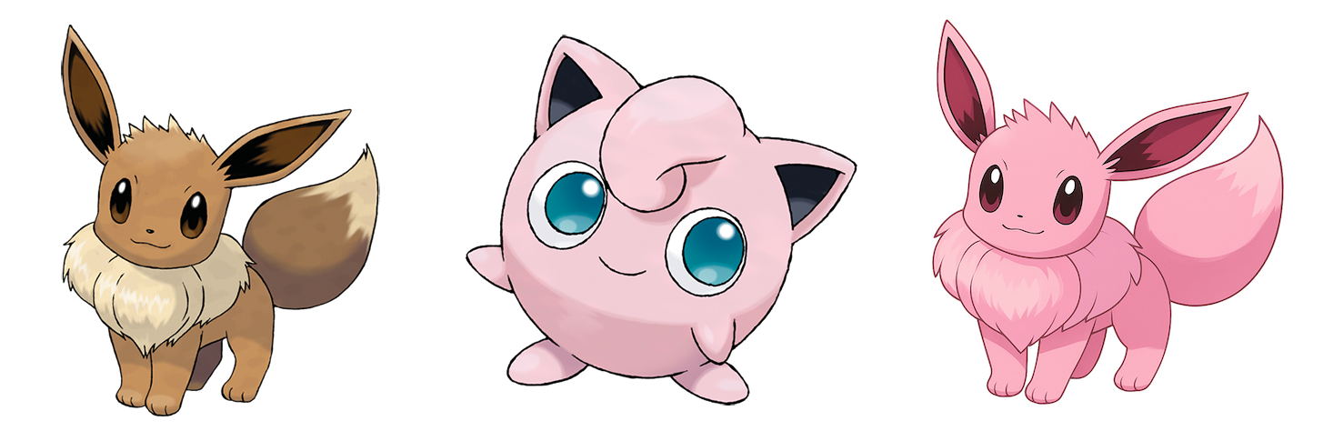
In this era of Generative AI, one might first and naturally ask: can models do this task? To answer this question, I used ChatGPT by prompting it to generate an Eevee image using the color palette in Jigglypuff. Below is the result from ChatGPT. I think it did a good job in generating a nice-looking pink Eevee. But it failed to use the blue color in the eyes of Jigglypuff.
Our algorithms made an interesting and different choice. It created a blue Eevee with pink fur near its neck and tail tip. So it used both colors. But one might argue that the pairing of blue and pink is quite different from the pairing of yellow and brown in the original image.
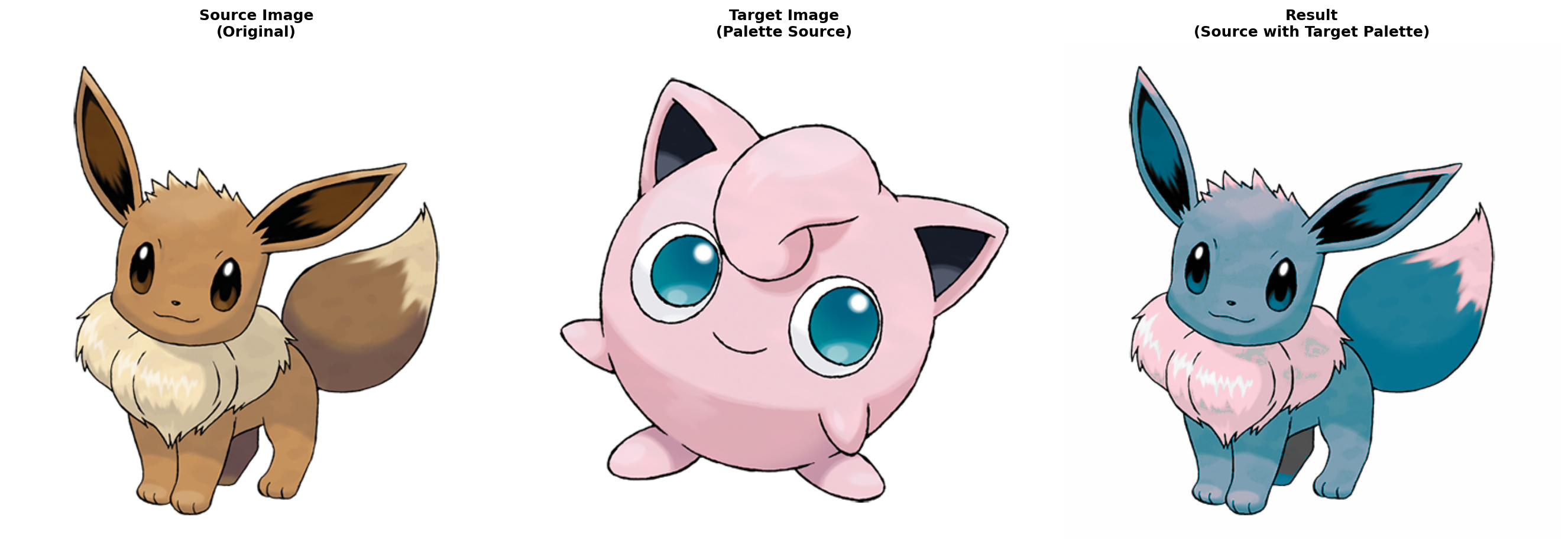
It is subjective which one of the above is better. Different people have different criteria. In our algorithms, we formulate what we think is “good” using mathematical concepts. This is drastically different from the ChatGPT’s data-driven approach.
Algorithms
There are two steps. First is to extract the major colors from an image. Second is to find a “good” permutation mapping between two color palettes.
Palette extraction
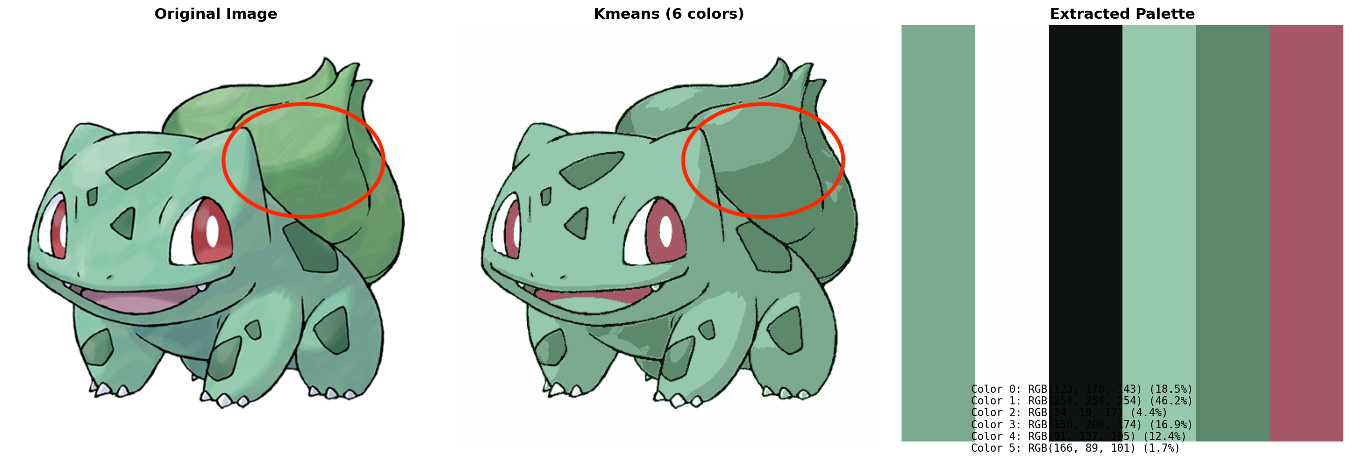
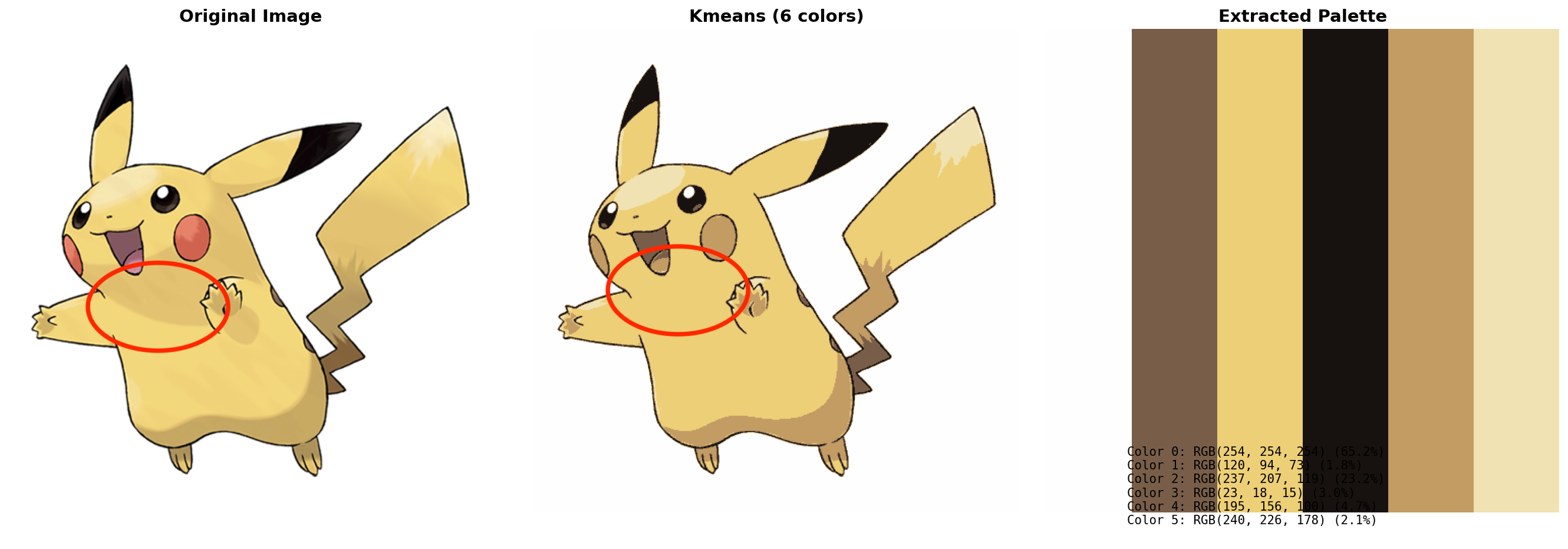
The high-level idea is to decompose the image into a weighted linear combination of color layers. I initially tried K-means (a clustering algorithm) for this task. The color of each pixel is then defined as the center of the cluster that it belongs to. However, such hard assignment has issues. If there are highlights in the image, the clustering result will either have divided patches instead of smooth gradients, or just simply omit the color change. See the examples below. The areas in the red circle are where the problems are.
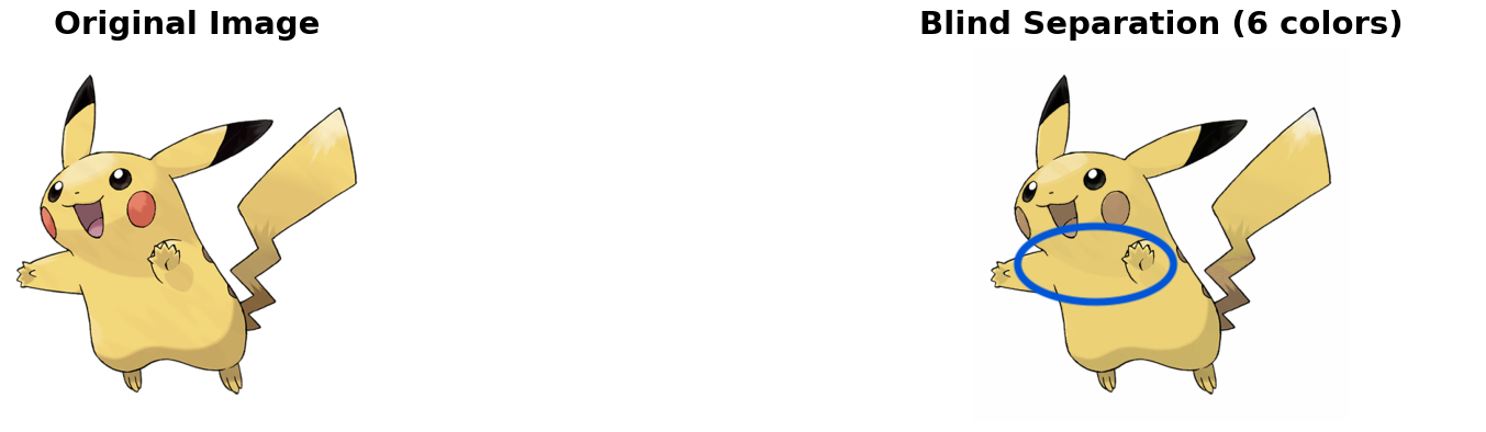
However, if we represent each pixel as a combination of colors, we will be able to mimic the smooth changes in the image better, though still not perfect. Below is a result of weighted color combination. The highlighted area around Pikachu’s neck looks more similar to the original image.
We formulate the weighted color combination task as an optimization problem. The goal is to find the parameters (colors as well as weights) that minimize the reconstruction and several other auxiliary losses. The auxiliary losses improve sparsity and diversity. In particular, every couple of iterations, we snap the color parameters to their closest colors in the image that haven’t been assigned yet. This is to enforce the constraint that we want the extracted colors to be directly from the image.
Palette matching
I really like the idea developed in the original post (OP) and I will use my own words to explain it. The most important task here is to define mathematically what a “good” color transfer is. As mentioned above, we want the color distributions of the source and target images to be “similar”. Therefore, we need to find a metric that measures the “similarity” between two images. However, it is hard to define such a similarity because we don’t know what characteristics should be equal. If the Euclidean distance between two images is high, does this necessarily mean that their distribution is different? We want to say that the pairing of (blue, yellow) and the pairing of (red, green) are similar.
Therefore, instead of measuring the distance between single images, we turn to measure the distance between image spaces. Consider the set of images that contains all the color manipulations of an image. We call the space $Q(I_S)$ and $Q(I_T)$ for the source and target image respectively. Given our desired properties of the similarity, we want these two sets to be similar. This is because if the two color distributions are similar, then their manipulated image spaces must overlap a lot. For example, we can adjust the hue, saturation, and value to “move” the (blue, yellow) pair closer to the (red, green) pair.
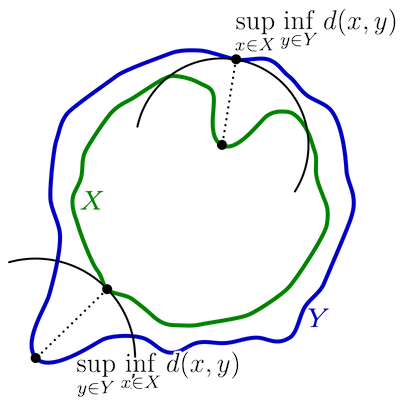
A common metric used to measure the distance between two sets is Hausdorff distance. And we use this metric as the optimization objective. In other words, we want to find the permutation $\pi$ such that the Hausdorff distance between $Q(\pi(I_S))$ and $Q(I_T)$ is minimized. When I chatted with the author of OP, she told me that we could prune some permutations during the optimization because black/white should always map to black/white.
One thing we still need to decide is how to represent an image as a vector, which is required in the computation of Hausdorff distance. In the OP, the author used VGGNet features. This is computationally expensive and usually requires GPUs for inference. Because I only have a MacBook Air, I tried a more lightweight approach by using color histograms and statistics. In my experiments, I did not find one method particularly better than the other. Both have good and bad situations. Let’s see some examples.
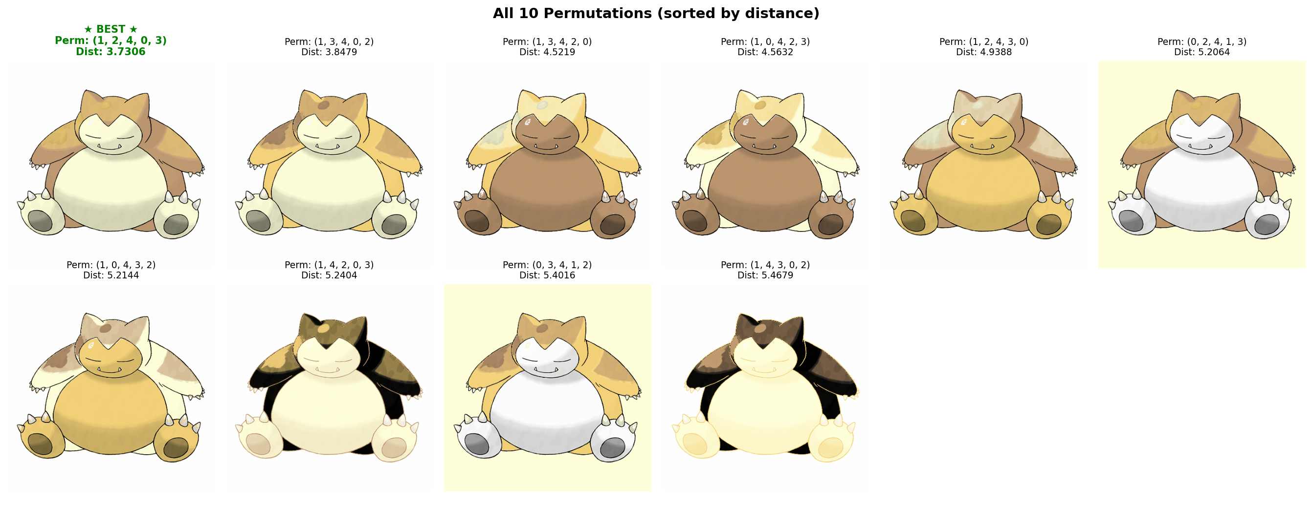
This first example is Snorlax with different color transfers. We use the VGGNet features. It shows how well our metric works. Here are the top ten permutations based on our metric. I think we all agree that the one with the shortest distance is the most visually appealing one. The color combination is the most natural. The belly is lighter than the body and the shades are darker.
However, sometimes it does not work so well. In this example below, I disagree with the metric and think the third (or fourth, they are the same) permutation is better. I think it looks cuter to have an orange body.
Next are two examples where the lightweight image representation, color histograms and statistics, is used instead of VGGNet features. For the top one, I (mostly) agree with the algorithm’s choice. Similar to the situation of using VGGNet features, sometimes I disagree with the algorithm. The bottom is an example where I found the top recolored Jigglypuff looks quite ugly.
Results
Though this project is motivated by Pokemon and examples are all shown using Pokemon images, the algorithms can be applied on any images. In addition to Pokemons, we also show results on abstract art pieces.
Pokemons
This is probably one of the best results I have. The palette extraction is very well-done, as we can see that the highlights/shadows are carefully preserved and the color segmentation is quite clear. The color transfer results are also harmonious. The recolored Charizard has multiple layers of similar colors and its wings always have different colors.
Art
I experimented with recoloring a Mondrian-style art piece using the works of Ellsworth Kelly. Below are all the pairs that I have tried. The first column is the Mondrian’s work. The second column are various Kelly’s works. And the third column is the result of color transfer.
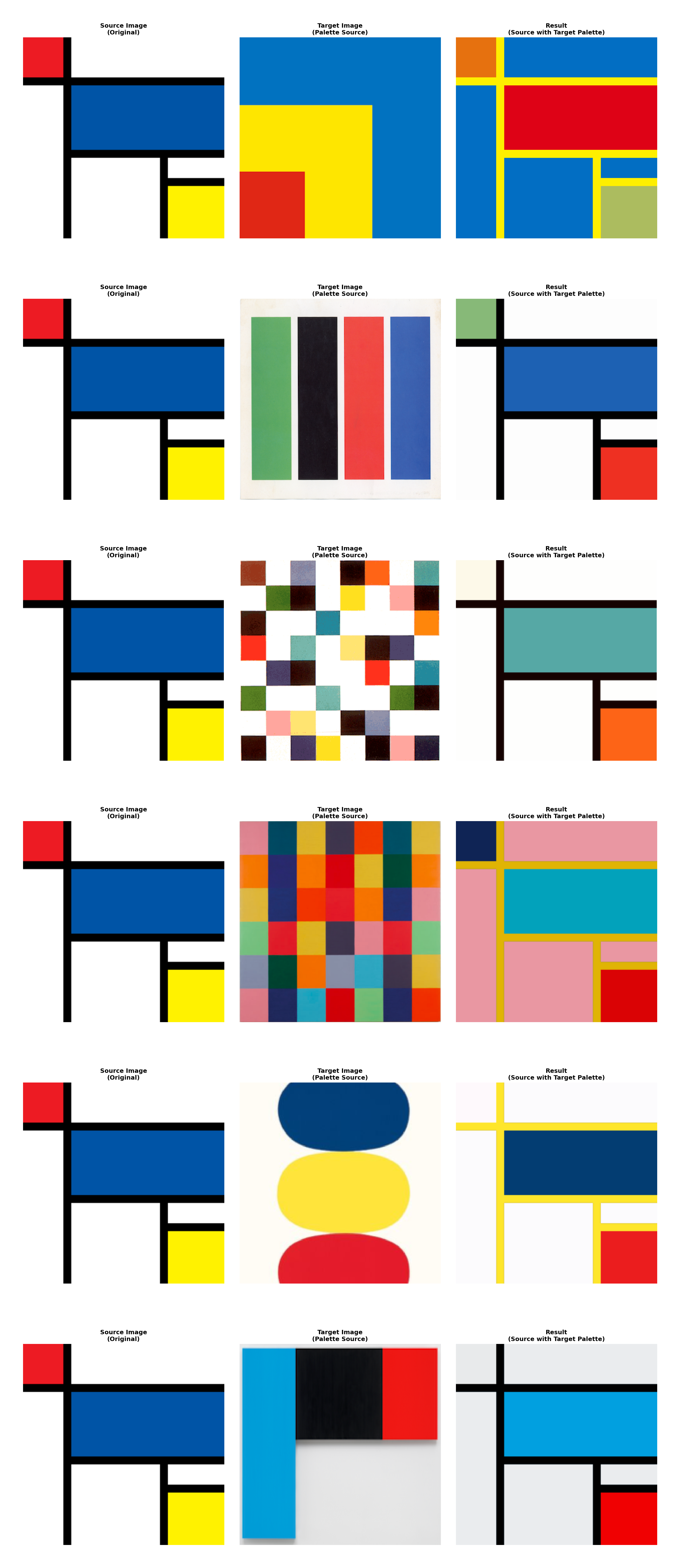
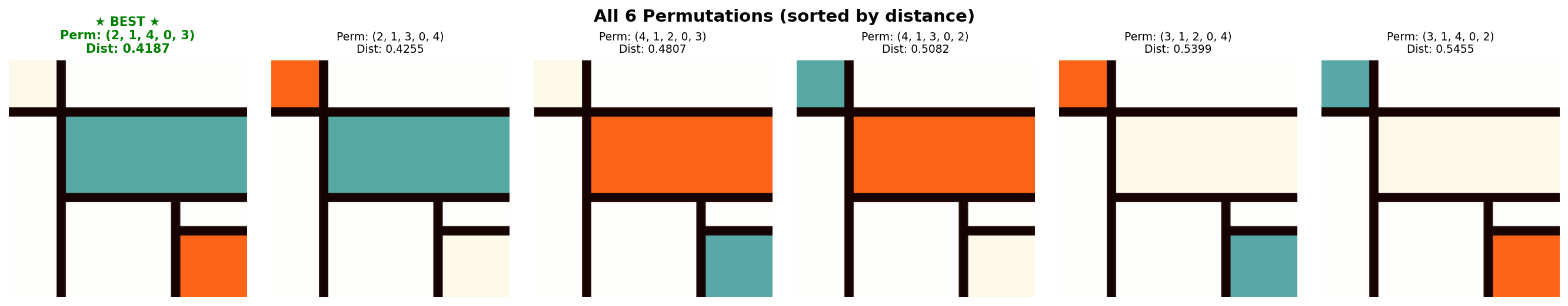
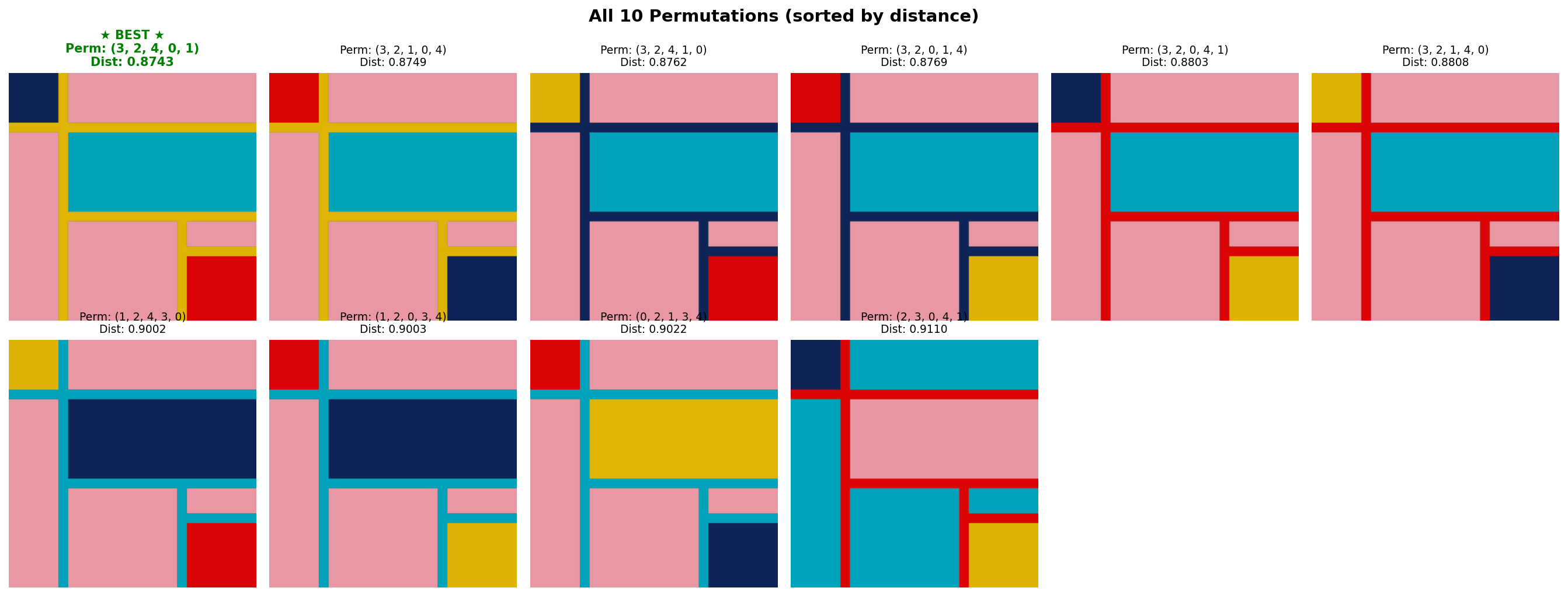
Abstract art is much more subjective and I found that most of the permutations are good. Here are the top ones corresponding to one of the pairs above. Also, since these pieces are essentially color blocks, it might not be challenging to find good permutations.
Implementation
Lastly, you can find the code here. To speed up the algorithms, I implemented some straightforward caching and multi-threading. When using VGGNet features, it is critical to utilize the GPU fully. With the help of Claude Code, I was able to increase the GPU utilization from about 30% to almost 100%. The key speed optimizations related to GPU are: